What to Include in a Website Outline
Site Structure
Lay out your site’s structure before you include it in your site’s outline. Keep it simple. Sketch on paper, in your notepad/notebook, or even a whiteboard. Alternatively, use these tools: Microsoft Visio, whiteboard, Excel, OmniGiraffe, or Google Sheets.
Here is an example of a simple structure:
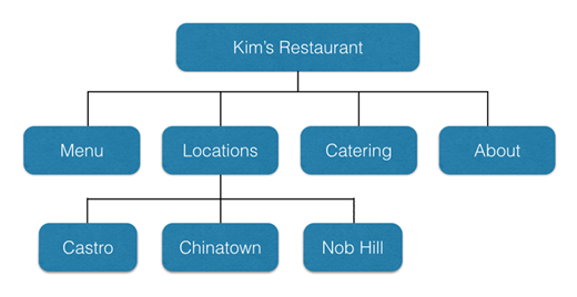
Image Source: Neil Patel
Here are the considerations when adding your site structure to your outline:
- Categorization - Categorize your webpages. Group the features and items that are the same together. When categorizing, keep the categories between 2 and 7. Balance out the subcategories. If each category has 5 subcategories, make sure that all of your categories have 5 subcategories.
- Page levels/depth - Go for a shallow page depth. Three levels are ideal. However, if your site needs over three levels, in industries like Ecommerce, go for it. The shallower the depth of the page levels, the easier your site’s navigation is.
- Have a global category - this is the only extra category that you need besides the 7. Here is where you put items like privacy policies, logins, and search functionalities. The items here are included as part of your header or footer.
Why Your Site Structure is Important
Your site structure determines your user experience, crawling, the sitelinks you are likely to get, and the internal links that your site will have.
A site with a great structure results in better user experiences, resulting in lower bounce rates. All these signals tell Google that your site is high quality, contributing to your site ranking higher in search engine results.
Search engine bots crawl your site’s structure to index your webpage. Your site’s entire structure needs to be summarized and submitted to Google Search Console. This is done using a XML sitemap.
Without the proper site structure, there are pages and URLs that search engine bots will never discover.
Appropriate site structure helps your site to have sitelinks in search engine result pages, like our example:
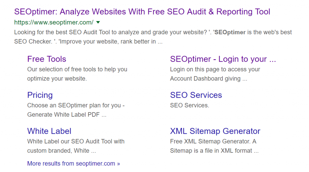
Sitelinks make it easier for users to choose the page that might be the most relevant. This increases your CTR (Click Through Rate), conversion rate, and even sales. Your site is also likely to rank higher than your competition.
Here’s what Google had to say about what goes on the sitelink:
“We only show sitelinks for results when we think they'll be useful to the user. If the structure of your site doesn't allow our algorithms to find good sitelinks, or we don't think the sitelinks for your site are relevant for the user's query, we won't show them.”
A site with a great structure results in creating internal links which helps with user navigation. It also makes it easier for search engines to identify related pages, reduces site depth, and helps to pass link equity to other pages.
Here is a web page with sitemap templates that you can draw inspiration from.
Website Layout
Your site’s structure gives you a skeleton sketch of your site. It helps you know the number of columns you need, for example. You now need to list the items that will form your site’s layout. Begin with your landing page, as it is the first place that your site visitors are likely to visit.
Homepage/Landing Page
The landing page is what users will use to determine whether they need to spend more time on your site or not. What to keep in mind here is that the layout will help a great deal with making user navigation easy.
When coming up with your landing page’s layout, think about what goes above-the-fold, and what goes below-the-fold. This means what goes before scrolling (above-the-fold) and what comes after scrolling (below-the-fold).
Here is an image to help differentiate between above-the-fold and below-the-fold:
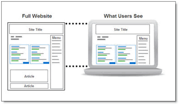
Image source: Performics
Above the fold
Here is what to include above-the-fold in your site outline:
- Logo
- Headline
- Sub-headline
- Navigation bar
- Primary CTA (Call To Action)
Subcategory these items, for example, categorize the logo under the nav bar. Add images or embed a video depending on your industry.
Below the fold
Here is what to include below-the-fold in your site outline:
- Events
- Blog articles
- Industry trends
- Trust indicators
- Press coverage
- Location information
- Benefits and/or features
Depending on your industry, further group the above items. Put location information under the footer, for example.
Here is a graphical representation of the categories to put above and below-the-fold.
Features
List the features you want to have on your site. Just think about what is your must-haves for your site? To help your customers get the information they need, and act on it? All of the UI/UX, SEO, and so on. These include:
- CTA
- Blog
- FAQs
- Forum
- Gallery
- Security
- Newsletter
- Comments
- Testimonials
- Lead magnet
- Sign up/login
- Shopping cart
- Payment processing
- Social media - share buttons/links
You may not know where exactly to place these features. This will become clear when you build your wireframe (which is a visual representation of your site outline. It shows your site’s layout, navigation, and content. Learn more about wireframes in this article.
Here is an example of a wireframe:
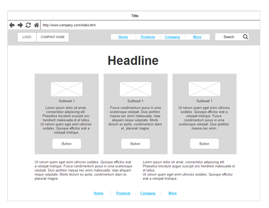
Image source: Smartdraw
Style Guide
Style guides and pattern are essential to help the web designer maintain the structure and create experiences for our audience for various devices.
The benefits of style guides are many: they create a common language, make testing easier, saves time and effort, and create a useful reference to keep coming back to. These include:
- Lists
- Buttons
- Headers
- Paragraphs
- Responsiveness
- Links - active/inactive/hovering
- Background - white/black/brand colors
- List the colors you want to use. They should be in line with your brand colors.
In your outline, put the related styles for each item in parentheses.
Resources
The main driver of resources is what you can do for them, what have you done so far, why should they choose, how you can help. Along with the style guide you need to create these messages across different methods that attract your audience the best.
List the resources that you will need to achieve the functionality that you intend. These include:
- Icons
- Fonts
- Videos
- Testimonials / Reviews
- Illustrations and graphics
- Marketing copy - white papers, press releases
- Images and their sources - company photos/stock
In your outline, put the related resources for each item in parentheses.
Navigation
Decide the navigation that you want based on your site structure, page layout, and features (both top and below-the-fold). It can be top, bottom, side or center. It can also be fixed (static) - where it does not change position with scrolling - or sticky (moves as the user scrolls).
Here are a few navigation options:
Top navigation
There are several options here.
This is a hamburger menu, that you are likely to find on mobile devices:

Image source: Template Toaster
Fixed top navigation
This navigation does not change position as the user scrolls. Here is a demo:
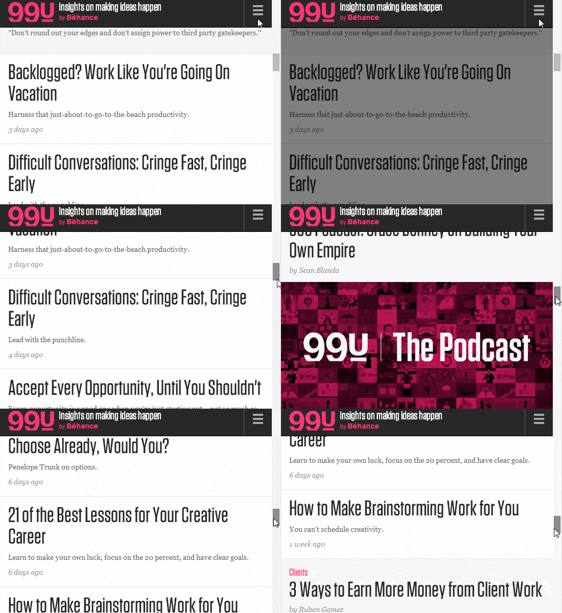
Image Source: WebFX
Static sidebar navigation
The screenshot below shows the navigation on the left side, and stays in the same place even as the user scrolls.

Image source: Template Toaster
Static bottom navigation
Here, the footer is used as the main navigation. Here is a screenshot:
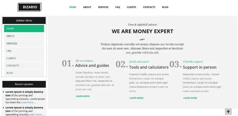
Image source: Template Toaster
Caveat
You must create an outline for each page. Each page on your site is different. While features like the header and footer remain the same, your landing page and about pages must be different, even though they have the same look and feel for consistency.
Template
Here is a template that summarizes all the above-discussed details. Replace the descriptions between the square brackets with your own company’s information.
In conclusion
When creating a website outline, don’t go into much detail. The outline is a guide that helps you keep your website design on track, structured and clear. Leave room for adaptation and creativity.
