As part of our commitment to continuously improving SEOptimer, we've just made another major release to the website. Most of these changes focused on aesthetic and layout improvements to the site, with a sprinkling of bug fixes.
This means that SEOptimer's reporting behaviour will look more or less the same, but we do have some big product and functionality improvements in the pipeline for the coming months, so stay tuned.
Today's improvements include:
- The ability to put subscriptions 'on hold', and unfreeze them - This is a replacement to our 'cancellation' functionality, making it easier to get started with SEOptimer again as opposed to completely cancelling your account and needing it manually re-enabled.
- GDPR consent checkbox on Embed forms - You can add a consent checkbox, which will be mandatory if added, and customize the label to tell the user what action you intend to take with their data. Additionally, this consent status will be recorded within the 'Leads' tab of the Dashboard, so that you have full auditability on consents provided by users.
- Improved some logic in the Social Checks - for example the Facebook checks will now accept links on a page pointing at Facebook Profiles (in addition to just Facebook Pages themselves). We also handle a bigger variety of Instagram pages now.
- Improved case sensitivity - We found a few small bugs with websites having mixed case tag names like <meTA>
- Increased meta description max length check to 320 - This actually happened a few weeks ago, but thought we would mention it now. Google has called out that they will display longer snippets, so we have increased our check limits.
- Improvement Sitemaps check logic - we now check a few additional default locations for a sitemap, like /en/sitemap.xml and have better handling of multiple sitemaps for a page.
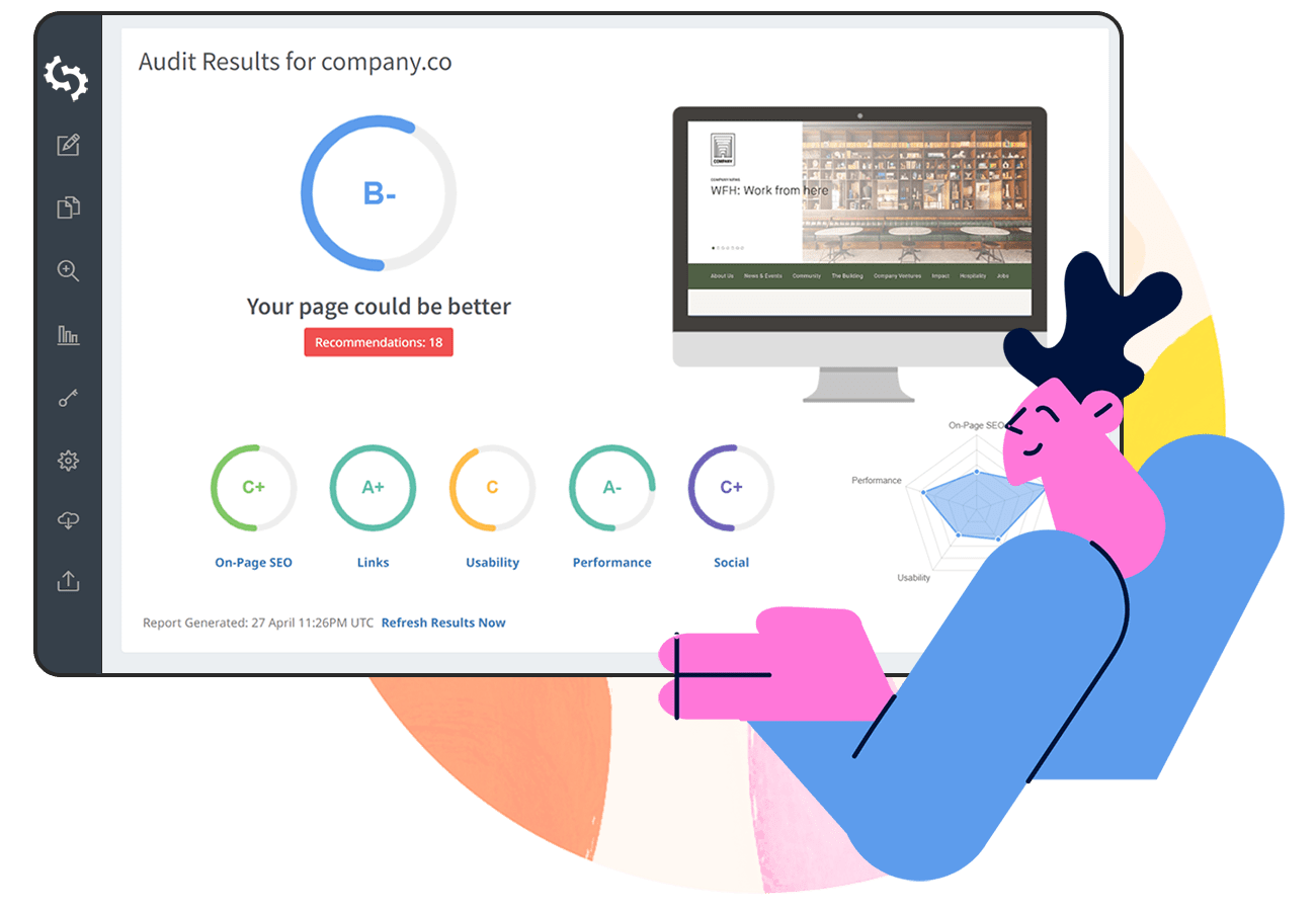
- A full reboot to the website itself - including new logo throughout the site, new content, more detailed explanations of features and examples across the pages.
- A more logical page structure - we now have Features, Pricing, and Signup clearly visible. No more being asked the embarassing question of 'how do I signup' :)
- Smoother signup flow - We've broken this into multiple parts so users are not overwhelmed with information on the last step.
- Redesigned blog - in anticipation of lots of new exciting content coming soon!
We hope you enjoy the changes. Please reach out if you have any comments, issues or feature requests. We're always excited to hear your feedback.


