Today’s business landscape is a hybrid of in-person and digital experiences. Building a navigable website lends a major boost to your business’s credibility because it gives customers a reliable, ever-present source of information in an easily accessible format.
While modern website-building tools make it easier than ever before, it is still important to know the basic anatomy of a website. Each component serves an important purpose on your site and taken together should offer visitors and customers alike a seamless experience with your business.
Here are the key web page components you need to know.
Basic Parts of a Website
These are the key website components. Most of us don’t think about them as we navigate through the internet but would notice them if they were missing or somehow off, because they are essential elements.
Header
The header is the top portion of your website that contains the logo, menus, usually a search bar, and often simple call-to-action buttons like an email opt-in or “call now” button.

The current trend is for simple headers that load quickly rather than heavy, image-laden ones that take up half the page.
It’s important to keep the header consistent across each of the pages on your site so visitors can easily navigate around.
Footer
The footer is the bottom portion of your website and acts as a secondary menu. It contains links to information like:
- Legal info
- Careers
- Privacy/Terms
- Contact Us
- About Us
At a minimum, your footer should have your copyright info and privacy policy and terms.
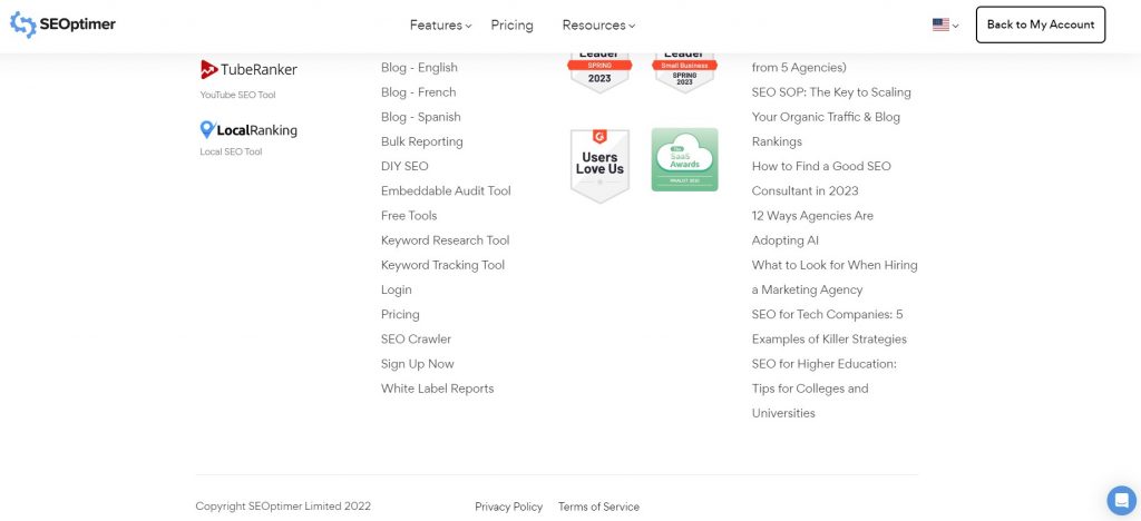
These are important legal details. Many web pages also contain a site map in the footer. This is helpful for large websites with multiple sections, as it helps users navigate around the site more quickly.
Sidebar
Sidebars are one of the most customizable parts of a website.
They can be on the left or right side of the page, or both. They contain any combination of the following:
- CTAs
- Social Feeds
- Recent Blog Posts
- Email Opt-Ins
- About Us
- Bios of the authors
- Shopping widgets
- Customer testimonials
- Contact info
- Videos
Choose the most important few for your sidebar to avoid a cluttered feel.
Menu Navigation
Visitors need a way to visit different website sections. Your menu is a map of your site and should be accessible from the header.
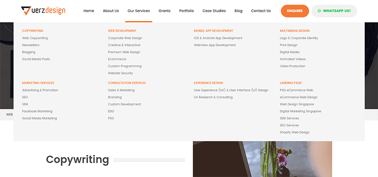
Menu links should be divided by category in a way that makes sense for your business – for example, residential and business services for a plumbing company.
Clicking on a link directs visitors to different pages on the website.
On mobile, the menu is usually represented as three lines stacked on top of each other – i.e., a “hamburger menu.” Browsers tap the menu to view expanded options. Make sure each web page is linked to your menu, or visitors won’t find it. Expandable menus can help reduce clutter on the header of your site.
Body Content
All the design features ultimately exist to complement the body content of each page.
This usually refers to the written content of a page, though if you have an image-heavy page (like a photo gallery, for example), then the photos are the main body content.
The term “body” refers to the HTML code for this section, which tells your content platform to place this in the large open space in the middle of your page.
Breadcrumbs
Breadcrumbs are similar to a site’s menu in that they help the user understand where they are currently located on your website. Breadcrumbs can also be used to navigate from one page to another if the website is arranged in a hierarchical manner.
Not only are breadcrumbs useful for humans, but Google also uses breadcrumbs to understand your page better.
This has an impact on your website’s SEO since Google can rank your web pages for appropriate search queries.
Here’s an example of breadcrumbs on an ecommerce website:
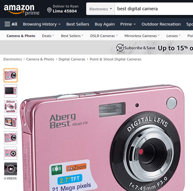
As you can see from the breadcrumb trail, the user is in the “Point & Shoot Digital Cameras” category, but can easily navigate to the “Camera & Photo” category just by clicking on the link.
Breadcrumbs aren’t only limited to ecommerce websites though. Many SaaS companies use breadcrumbs in their blog posts.

Images/Feature Image
Webpages need visuals to grab the viewer’s attention and quickly communicate what type of content they will find on that site.
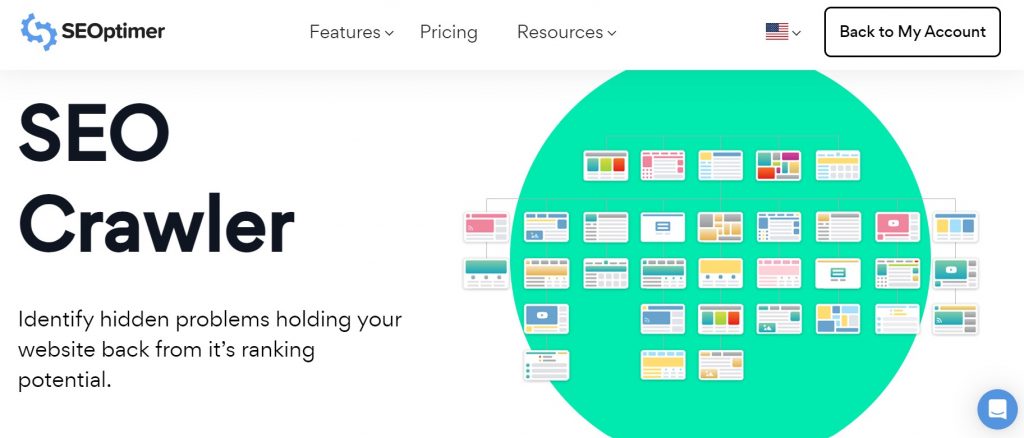
Most pages contain a feature image or hero image. This is the representative image for each page. Other images should be included as well, but the feature image should be first.
On WordPress, a Featured Image is also known as a post thumbnail. This image is indexed with the webpage and appears in searches as the visual connection for any given page.
Slider
The website slider is a collection of images or videos that rotate automatically, almost like a slideshow, hence the name “slider”.
Sliders can be placed on any part of a website, but they’re especially common as a replacement for the hero image on the home page.
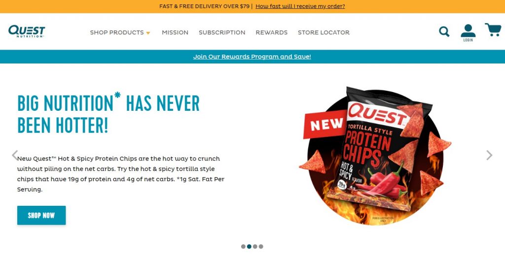
Sliders are common elements on ecommerce websites. They typically include a headline, some text, an image, and a call-to-action button.
Social Sharing Buttons
When someone lands on your website, you want to make it as easy as possible for them to share your content or products with their friends.
This is where social sharing buttons come into play. Social sharing buttons give visitors the ability to share pages on various social networks such as Facebook, LinkedIn, and Twitter. You can also add a button that visitors can use to share your content via email.
These elements can be added to various other website parts such as the footer, the sidebar, blog posts, etc.

Core Website Pages
Every website has a collection of core pages that are crucial to the anatomy of a website. These are:
- Home
- Landing
- About Us
- Contact
- Blog
We will cover what each page is for.
Home Page
This is the home base and one of the core components of a website. It links to all your other pages and serves as a welcome and introduction for visitors. It usually includes a feature image, links to the key content on your site, and a key introduction to or the benefits of your business.
The logo that you include in your header (which should be on every page, remember) should link back to your home page just in case visitors get lost in the different sections of a website.
Your home page should stay consistent but always up to date. Outdated websites erode customer confidence.
Landing Page
A landing page is different than a home page. Landing pages are typically connected to a promotional campaign and give leads a place to land when they click on an ad or social post.
Landing pages are simple and promote one direct call to action, like "buy now", "call for a free quote", or "download the guide".
You can create multiple landing pages for specific promotions or campaigns and should retire outdated ones to avoid directing leads to useless content.
About Us Page
Your “About Us” Page is one the most important on your site.
It’s often a first stop for new visitors to your site and should include a bit about your history, mission, and distinctive.
Contact Page
Your contact page is essential and should be accessible from any part of your site via a sidebar or header menu.
Keep this page simple and navigable. An email us form, address, and phone number are essential components.
Website Blog
Blogs are a great tool for driving traffic to your site with authoritative content. Your blogs should be accessible from a blog page that lists each post sequentially, with the most recent at the top.

You can also have a section for featured blog posts that you want to highlight or a place to showcase your most popular posts.
You may need to divide the blog posts into multiple pages to speed up load times. Make sure you keep the posts in chronological order, though you may allow viewers to sort articles by topic or category, especially if you have a lot of posts.
404 Error Page
When one of your website URLs has been deleted or moved, visitors will land on a 404 error page if the deleted URL hasn’t been redirected.
Even though it’s not really good for your SEO or website’s user experience, you’ll end up having 404 pages as your website gets more and more pages. It’s almost inevitable.
However, don’t let users land on just some regular 404 page that doesn't do anything to keep them on your website.
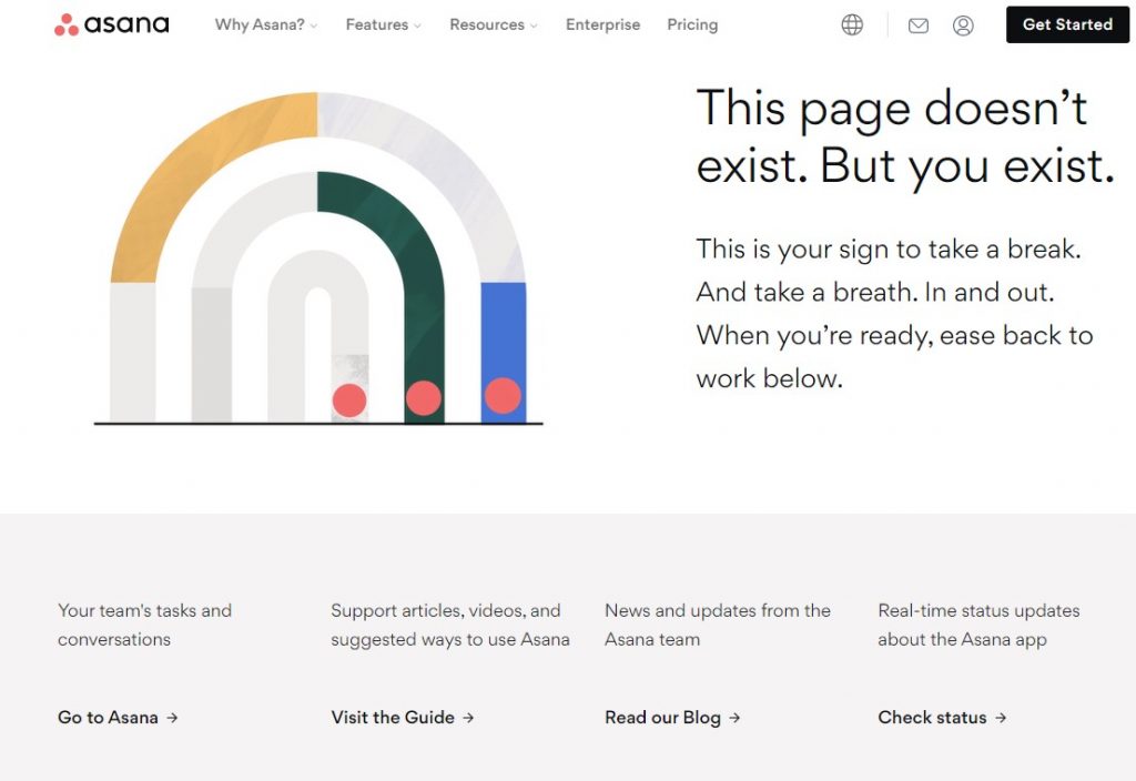
Instead, you should create a custom 404 error page for your website with links to other important pages or “money pages”.
You can also add a search bar or a link to your home page.
If you look at Asana’s 404 page, you’ll see that they’ve used the opportunity to redirect visitors arriving on dead pages to their home page, blog, and useful guides.
Important Website Concepts
There is a lot of jargon thrown around when it comes to website design. Here are a few of the most important terms to know.
Above the Fold
Newspapers are folded, and the most important story is customarily placed on the front page towards the top so it can be quickly scanned even when the newspaper is folded.
Regarding web page sections, “above-the-fold” means content that visitors can view without scrolling down the page.
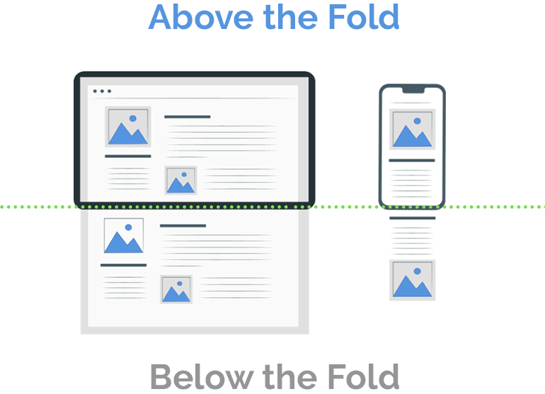
Research indicates that people spend up to 80% of their scanning time on above-the-fold web content, mostly deciding whether they want to bother scrolling down to keep reading.
This should be attention-catching content, like a strong headline, interesting feature image, or a one-line summary stating what the page is all about and why it is valuable.
Call to Action (CTA)
Websites can have more than one CTA, and they can be located in several different parts of a website: the sidebar and header are the most common.
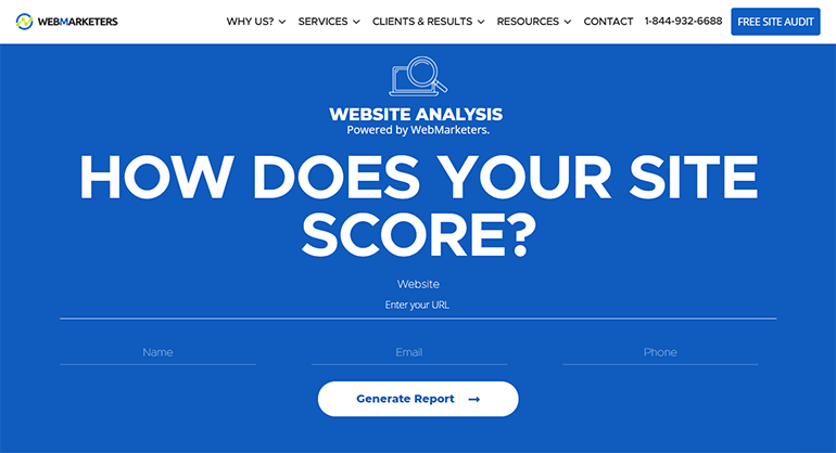
Call-to-actions invite viewers to do something to further interact with your brand and appear on your webpage as a popup or form. Common phrases include:
- Subscribe
- Learn more
- Try it free
- Order now
- See How
- Act now
- Book your next adventure
- Call us
- Schedule your consultation
- Get matched
- Treat yourself
- Get 10% off
CTAs should be urgent but not pushy and should match the tone of your brand. These usually require the viewer to submit an email address.
All of your most important web pages – home page, contact us, about us, and blog page -- should include a call to action, even if it’s as simple as an email opt-in form.
Forms
A web form is a page where users voluntarily enter personal information. Surveys, email opt-ins, shipping updates, and loyalty programs are all processed via web forms.
Keep forms short and clear, and always include a statement about how the information will be used. According to HubSpot, improving user experience with web forms increased businesses’ lead conversion rates by up to 75%.
Mobile Responsive Web Pages
Worldwide, half of all internet browsing occurs on a mobile device. Additionally, more users make purchases via mobile devices. This means your website needs to be optimized for easy viewing and interaction via smartphones and tablets.
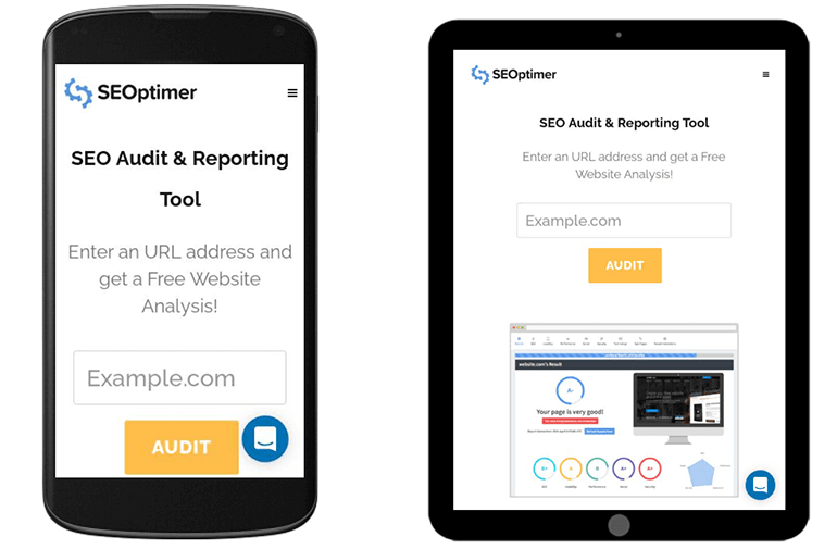
This doesn’t happen automatically. Some website builders are geared towards mobile-friendly webpages – Constant Contact is one example.
Good mobile web pages are simple, have a clear CTA, and feature high-quality images.
Website Builders and Content Management Systems
Web-building services like WordPress and Shopify have made it drastically simpler to build a website without advanced technical knowledge.
This is where most people begin the process of designing and building a website. Every page is essentially a series of code, and a website builder lets you design a website without accessing this code directly.
Users choose from a series of pre-designed templates, which offer varying degrees of customization.
Website builders allow website managers to upload new content, alter the layout of the site, integrate forms and social feeds, and add special tools called plugins.
Most web builders are also called content management systems, which just means you can write, edit, and post your content using its interface.
We’ve considered some of the most popular website builders here:
WordPress
One of the most popular website builders available is WordPress.
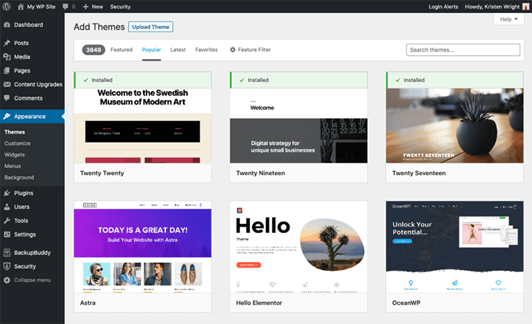
With endless customization options and a reasonable annual cost, WordPress also offers many mobile optimization options. While you may have to tweak some HTML here and there, it is mostly user-friendly.
Shopify
Arguably the most customizable e-commerce website builder, Shopify has over a million and a half users worldwide. It has an integrated payment system, which makes it a great choice for web stores.
Wix
Wix is a good choice if you want to get started quickly and aren’t as finicky about customization options. While it doesn’t have as many blog organization options as WordPress, it can be a good choice for small businesses who want a storefront plus some content options.
Squarespace
All of Squarespace’s templates are automatically mobile-friendly and the simple, bright designs are favored by public figures like Amanda Gorman. It’s also less expensive than some competitors.
Weebly
A good choice for e-commerce sites, Weebly has an intuitive interface and offers a limited experience for free, with modestly-priced tiers offering additional functions. It has an Apps section rather than plugins, which might be more familiar for WordPress users.
Technical Parts of a Website
The behind-the-scenes information like hosting, domains, and CMS is still important to fully understand the anatomy of a website. We’ve covered the most important components below.
Plugins
Plugins are like apps that add functionality to your website. Your website builder will offer a menu of plugins compatible with its interface. Some are free and others require a subscription or an account with a third-party service.
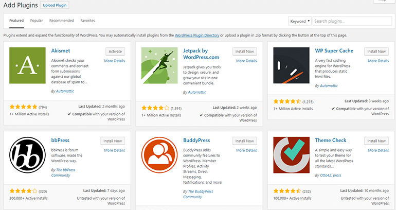
Plugins can be found on many parts of a website, and can include:
- Social share buttons
- Embedded videos
- Email opt-in forms
- SEO tools
- Share counters
- Popup generators
Hosting
Web hosting is essentially your small part of internet real estate upon which you build your website. All websites need to purchase hosting, which is renting space on a server to store and publish your content.
Like rent, hosting needs to be renewed annually. Most website builders also offer a list of compatible hosting services.
Domain Name
Each website has a unique location on the internet accessed by it’s IP address. This address is a long series of numbers, so there is a “human-friendly” text version called the domain name.
The domain name is also called the web address. It follows the standard formula:
www
domainname
.org, .com, .edu, etc.
This should communicate the nature of the website as clearly as possible, plus be easy to remember and spell.
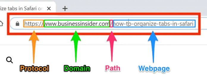
For example, celebrities often choose their own name as their domain name. A common name might already be taken or a hard-to-spell name might make it hard for people to find the site.
URL
URL stands for Uniform Resource Locator and refers to the exact location of any given webpage. It includes your domain name and specific page information.
Domain names direct users to the home page of the site. URLs direct to a specific page on that site.
For example, https://www.taylorswift.com/ directs to the homepage of the official Taylor Swift website, while https://store.taylorswift.com/collections/new-merchandise-beach-collection/products/just-a-summer-thing-scrunchies directs to a page featuring a particular product on the site’s store.
Most website builders provide some control over the URL. If you choose not to customize it, it will be automatically generated based on the name of your web page.
SSL
SSL stands for secure sockets layer and is a type of code that ensures secure encryption between a server and a browser.
This protects the data that passes between the two locations. This prevents third-party attackers from intercepting data that is entered in the browser as it makes its way to the server. Therefore, it is recommended that any site asking for personal information obtains an SSL certificate.
SSL certificates come in a range, with different levels of protection. Higher-security certificates are usually required by law for financial or insurance websites, for example, while a standard e-commerce site will have lower security requirements.
The cost of the certificate also depends upon the level of security it provides, and most need to be renewed annually.
SEO
SEO stands for Search Engine Optimization and is the primary way your website gets found by search engines (most notably Google).
Most searchers only click on the first page of search results, so it’s crucial that your site appear useful to Google.

This is accomplished through optimization, or including keywords in different parts of a website.
Conducting keyword research identifies which keywords your target audience is searching for. There are many tools designed to conduct keyword research, or using Google’s predictive search function is a good way to find long search phrases, called long-tail keywords.
Webpage sections to optimize include:
Meta Description: Each webpage has a meta description that explains what the page is about. Your web builder allows you to edit this directly to include important keywords.
Title Tag: Include target keywords in your titles to immediately show search engines and readers that this is the topic they are looking for.
Header Tags: Using the correct combination of header tags to structure the hierarchy of topics represents best practice for content publishing on your site.
Body text: Avoid scattering keywords everywhere, which hurts your Google ranking. Including them judiciously in the first paragraph is the most strategic way to optimize your pages.
CDN
CDN stands for Content Delivery Network and is defined as a network of servers placed in different locations all over the world.
The purpose behind CDNs is to increase the loading speed of your website or application by hosting your content/website files on a server that is closest to the user.
As a result, a CDN can reduce bounce rates and increase time spent on your website. Both of these are key in improving overall website performance.
Examples of CDNs include:
- Cloudflare
- StackPath
- KeyCDN
Sitemap
A sitemap is a file that lists all of the URLs of a website, along with useful metadata about each URL.
As the name suggests, it’s basically a “map” of your website. This map helps search engine crawlers to find and index all of the pages of your website.
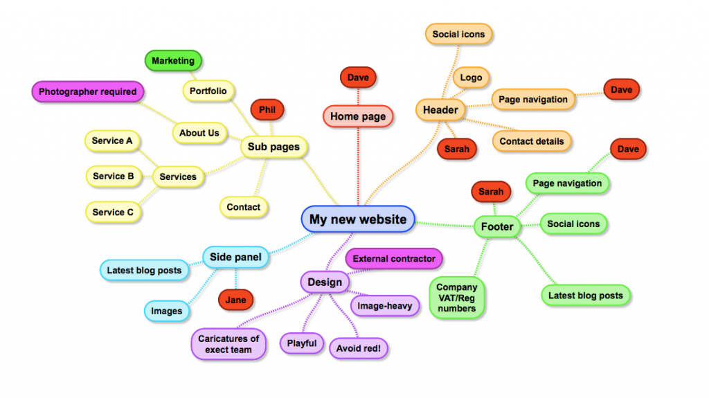
If your website contains pages that haven’t been indexed by Google, then those pages won’t be able to show up in the search results.
And as a result, sitemaps play a vital role in the indexability of your website.
Luckily most Content Management Systems automatically generate a sitemap of your website so you don’t have to manually do this.
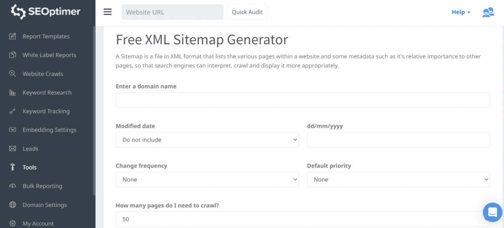
You can also use SEOptimer’s free XML Sitemap Generator tool to create an entire sitemap of your website.
How do you optimize your clients' sites? We'd love to hear from you. Tweet to us @seoptimer.
Click the image below to download our infographic about the Essential Parts of a Website.

