Crafting the perfect logo is a key way to build a new brand or revamp your existing business identity. Marketing company logos provide a vital first impression for creative agencies, so we’ve assembled inspiring examples to help you create or redesign your logo.
Why Agency Logos Matter
A logo is your company’s introduction to the world. One study indicated that 75% of consumers recognize a brand by its logo. Marketing company logos are the primary brand identifier, even before style or brand voice.
It is important to get your creative agency logo right. So, we have assembled 15 of the best marketing company logos and advertising agency logos to inspire your own design, whether you are revamping your brand or just in the planning stages of starting your own agency.
Top 15 Best Marketing Company Logos
The best ad agency logos have a few things in common:
- Maximum of two colors
- Includes the brand’s name
- Unique – helps a brand stand out
- Sets the tone – serious, playful, edgy, traditional, etc.
- Communicates quality, thoughtful design
- Quickly introduces the company’s brand
Here are the companies that excel at communicating their unique style with their agency logo. Each logo we selected stands out for its use of one or more of these key logo distinctives, and we’ve pointed out how you can use them as inspiration for your own logo design.
#1 – Jives Media

A good example of typography in a digital marketing agency logo, Jives Media uses color, font, and plenty of negative space to convey a clean, modern feel. Jives is a global digital marketing firm based in San Francisco. The unique shade and curving font convey style without being too trendy. The name is a clever contraction of the founder’s name, James Ives, and the simple design conveys professionalism. Designs that rely primarily on typography are a good choice for memorable agency names.
#2 – Direcly

Abstract images can convey certain ideas that underscore a brand’s specialty. Direcly, a technology marketing firm out of Florida, creative agency logo does this with curved lines nested together to suggest a satellite. This is a good design because Direcly focuses on combined marketing consulting and technology services for its clients. Directly offers valuable logo inspiration because it is a hybrid agency – a logo has to do double-duty, suggesting both proficiencies without becoming too busy or complex.
#3 – SocialLeaf Marketing
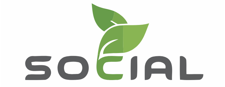
Organic motifs can also work well for marketing company logos. SocialLeaf marketing in Illinois focuses on social marketing, which ideally gains traction as content is organically shared. The green leaf image is stylized, keeping the logo from looking too generic and also suggesting the influence of technology on natural growth. When seeking inspiration for a social marketing agency or business, organic symbolism is a great choice. Just keep in mind that many brands use trees, leaves, and flowers in their branding, so it’s important to find a way to make your logo distinct.
#4 – The Spark Group
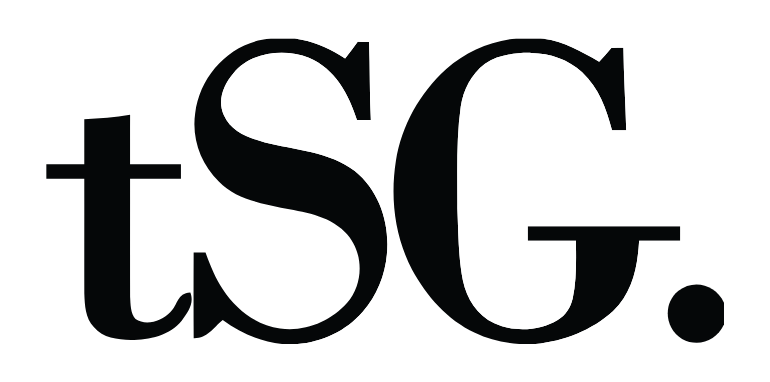
Acronyms can be used effectively, as seen with The Spark Group, a boutique digital marketing agency in New York City. The reverse white space and serif font convey a youthful, modern energy and the typography makes it stand out. If this style inspires your own creative agency logo, make sure your company’s initials do not also represent a better-known brand – for example, NYT for the New York Times.
#5 – JumpFly

Another example of abstract images in a logo, JumpFly is a PPC specialist in Illinois that actually breaks the two-color rule. The subtle colorful lines within the circle complement, rather than compete with, the black-and-white typography and suggest a forward-moving path or perhaps hitting a target, both aspirational ideas within marketing. The color changes are subtle, giving the brand a sharp, professional look.
#6 – Archetype Copywriting

Archetype is an international copywriting firm that uses a blue fountain pen in their logo. Just by having a look at their logo, we can already get an idea of what service they offer. The use of a blue fountain pen illustrates that this specialized marketing agency delivers a niche service - copywriting. When thinking of ideas for your marketing agency logo, consider using an illustration that clearly communicates what service(s) you offer. This gives a very clear and quick impression of what services your marketing agency can render for clients.
#7 – Digital Natives
A bold take on a fully abstract design, Digital Natives is an English digital marketing firm that uses a triangular design that suggests a tent, rocket, or upward moving arrow. The lime green and navy blue are trendy, distinctive colors that help with brand recognition – otherwise, the abstract design within the name included might be too vague. When using bold colors for your agency’s logo, consider your client base and whether they prefer edgy or traditional messaging – too bright, and the brand can begin to look childish or frivolous.
#8 - Tinuiti
Combining simple, modern typography with a creative take on the infinity symbol, Tinuiti conveys that this is a creative agency logo. This also underscores the company’s mission to unite brand voice across multiple selling platforms, creating a beneficial loop. The infinity symbol is further stylized with geometric shapes, which typically symbolize technological or scientific concepts. This logo is a good example of abstract symbols that are thoughtfully chosen and the geometric motifs can provide good inspiration for tech-niche agencies. This works well for Tinuiti, a marketing firm in San Diego.
#9 – KOTA
Is it possible to have two logos? KOTA, a well-known U.K. marketing agency, thinks so. The grayscale version of the logo represents the brand across the web on thumbnails and page headings. The full-size, colorful gradient version communicates KOTA’s personality as a fun and creative brand. When using these techniques for logo inspiration, it’s best to keep different versions similar to avoid confusion – for example, using a monogram for a shortened logo and a full name for the longer version.
#10 – Tuff
Leaning fully into typography, Tuff uses it’s quirky spelling and a showy font to convey its personality as a lean, accessible marketing team based in youthful Colorado. Priding itself on a scrappy, results-oriented team, the logo invites visitors and potential clients to dig a little further into the website to find out just what it’s all about. If your marketing company has a unique or clever name, this might be a good strategy for you to consider.
#11 – Listen Creative

While most marketing company logos use a combination of typography, icons, colors, and abstract design to convey their identity as a multifaceted design agency, Listen Creative manages to use all of these strategies – and it works. If you’re a fan of a maximalist design, then the use of bold colors, an intricate moth design, and strong vertical lines will appeal to you. Keep in mind that complex logos like this often need to be simplified for print media, but they certainly pack a punch on digital.
#12 – By All Means
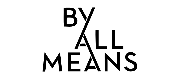
If the boldness of Listen Creative isn’t quite your style, then the understated elegance of By All Means, a creative agency out of Florida, might provide some inspiration for your ad agency logo. Curving lines and a simple, black-and-white palette are a good fit for brands where the name offers the primary method of communication and branding. More generic agency names – your city + digital marketing, for example – may want to include a few additional design elements to stand out in the crowd.
#13 – ClickRay

ClickRay is a Polish digital marketing agency that caters specifically to technology companies. Their logo conveys this with geometric shapes and typography that suggests the command keys on a keyboard. The sans serif font and splash of pink keep the logo from looking too serious – potential marketing clients generally want to see their agency as creative and youthful, not stuffy or outdated.
#14 – Dream Theory
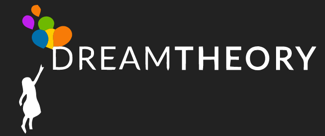
While most marketing agency logos use white space, Dream Theory uses a black background to offset its logo. A simple rainbow palette in the balloons is eye-catching but familiar; the ROYGBIV gradient is instantly recognizable and therefore not too busy. Adding the silhouette of the child to the logo underscores the creative edge of this full-service Florida marketing company, which is also suggested in its name, Dream Theory. This keeps the logo design consistent with the brand’s voice.
#15 – Creative Sponge

Last but not least, Creative Sponge is a creative marketing agency in the U.K. that uses subtle animation to make its creative agency logo come alive on a screen. Relying on a chunky font and basic white background, the word “creative” slowly changes cycles through several colors as visitors browse the website. The key to this technique is not to overdo it – excessive animations appear dated or gimmicky and may lead to slower load times. This logo works because the transitions are slow and graceful, drawing attention to the logo without being unduly distracting.
How to Design the Best Creative Agency Logo
As we’ve seen, the best marketing agency logos use the core elements of design to convey their personality and services. To design the best logo for you, reflect on how you want your brand to be represented moving forward, and then consider how you can represent those values using:
- Typography
- Color
- Negative space
- Abstract designs
- Symbolism
