Most of us have heard the folktale, Hansel and Gretel. Lost in the forest, the children use pieces of breadcrumb to mark their path back home. In web design, “breadcrumbs,” refers to a path - or breadcrumb trail - back to your website’s main content, named after the children’s path home.
What are Breadcrumbs?
A website breadcrumb strategy is a visual navigation tool that helps users locate where they are within a website’s content and how to return to an earlier page.
They are useful on sites with a lot of content across many pages that are organized in a hierarchical way. It is less useful for simple websites that have fewer pages.
Hierarchical website organization: A common method of website architecture where information is organized like a tree, with new content branching out from the central content.

Source: Icon made by ITim from www.flaticon.com
Examples of Breadcrumbs
Breadcrumb navigation is primarily a visual tool, so it is often easier to show. Take this example from furniture superstore Ikea:

This store has massive numbers of products and its website can be viewed by individual item or conceptually by room. The breadcrumbs at the top of this page so the user that he is viewing kids’ textiles, but can return to an earlier step by clicking on:
- Kids
- Baby & Kids
- Products
Why Should You Use Breadcrumbs on Your Website?
If your site has a lot of pages organized in a hierarchical manner, then breadcrumbs might be a good choice.
Though there are no hard and fast rules, the following sites often use breadcrumb navigation successfully:
- Ecommerce sites with many product listings
- How-to sites
- Educational sites
- Finance sites
These types of websites typically have a lot of content that is organized in a logical path from main pillar pages to more specific content, making a website breadcrumb strategy useful.
Benefits of Breadcrumbs
A breadcrumb trail is not just a stylistic choice - it can form a valuable part of your user experience.
Here are some key benefits of breadcrumb navigation.
Makes Navigation Easier
Breadcrumbs help visitors visualize where they are on a website. With the Ikea example above, a customer may decide that she doesn’t want to view bedding but she does want to view other kids’ products. She simply clicks on the appropriate breadcrumb to navigate to the page she wants.
Decreases Bounce Rate
Customer confusion or an inability to find what they are looking for are two leading contributors to a high bounce rate.
Breadcrumb organization gives customers a quick way to move around your site, making it more likely that they will visit longer and even make a purchase, subscribe, or take another desired action.
Reduces Clicks to Return to a Higher Level Page
Good web design encourages visitors to keep browsing. By making it easy to return to a higher-ordered page with minimal clicking, web designers can drive more traffic to key web pages on their site.
Conserves Screen Space
No one wants a cluttered website design. At the same time, customers want to find what they’re looking for quickly.
Breadcrumb navigation uses a simple design that doesn’t take up a lot of space. This makes it appealing both to customers and web designers.
When NOT to Use Breadcrumbs
If your website doesn’t have that many pages or they are not arranged in a hierarchical manner, then a breadcrumb trail won’t really add anything to the user experience and is best left out.

The above example is taken from author Jon Acuff’s website. This site has relatively few pages, and they all fit comfortably on the main navigation menu.
Additionally, there is no hierarchical structure to the site. A visitor does not necessarily progress from “About” to “Books” or “Speaking” in a particular order.
The designers of this site chose to omit breadcrumb navigation because it’s unnecessary for this type of site.
Breadcrumbs and SEO
A breadcrumb trail can also boost your SEO.
Google uses breadcrumbs to organize information and can also display your breadcrumb trail in search results. Breadcrumbs SEO helps Google understand and index your page more accurately, therefore serving searchers better matches.
The UX benefit will also ultimately help your SEO rankings because it should decrease your bounce rate and lead to longer customer interactions with your site.
Breadcrumbs Best Practices
When done correctly, breadcrumbs can improve the user experience of your website.
There are some best practices to follow when designing your breadcrumb navigation.
Place at the Top of the Page
People are comfortable with the familiar; it is conventional for breadcrumb navigation to be placed at the top of the webpage.
This makes intuitive sense because users typically scroll to the top of a page when they realize they want to be on a different page. Keeping the breadcrumb trail at the top reinforces the belief that users can find what they’re looking for easily.
Use Words or Phrases
Though it might seem creatively appealing to use images on a breadcrumb menu - just don’t. It’s confusing because images can be ambiguous. The “home” icon might be the one possible exception to this because it is so ubiquitous.
Stick to a single word or short phrase. For example - Home > Products > Men’s Clothing> Pants > Jeans is a logical breadcrumb format for a clothing eCommerce site.
Must Add Value to the User Experience
A website breadcrumb trail is not automatically the best choice for every site. If you have relatively few pages, a breadcrumb menu will unnecessarily clutter up your pages’ design.
Only use breadcrumb navigation if it actually boosts the user experience.
While UX design gets into the minutiae of what kinds of menus to use and when, it’s generally true that if your breadcrumb menu is only two or three steps long, you don’t really need it. You can simply use the main navigation header or even a hamburger menu just as effectively.
Keep it Short
Don’t use lengthy phrases that won’t fit in a short row. For example, a step that reads “all men’s winter clothing sizes s-xxl” would be too long.
Don’t add in unnecessary pages thinking it will make your website look better - it will just make it look cluttered.
Hierarchical
Breadcrumbs should lead the visitor back to a higher-ordered page. That means the first breadcrumb should always be the home page, because that will give the user a sense of where she is on the page.
Each breadcrumb should start with a parent page and then sequentially list the child pages that come after, even if a visitor came straight to a lower-ranked page from a search engine or direct link.
Use a One-Character Separator ( or )
To keep conventional and familiarity working for you, use a one-character separator between each breadcrumb.
The special characters < and > are the most common because they suggest arrows. Avoid using slashes like - or | or \ because they aren’t directional and don’t visually communicate the progression from parent pages to sub-pages.
Types of Breadcrumbs
There are three main types of breadcrumb structures for websites. Think carefully about your user’s intent and overall experience with your site before you decide which kind will be best for you.
Location-Based
Location-based breadcrumbs show the progression of pages from the parent page to sub-pages, much like you may have subfolders on your computer.
This is the most common type of breadcrumb trail because it serves as a visual map for visitors, showing them where they are on the site and where they can go.

For example, the above screenshot was taken from Connecticut’s state parks and forests website.
The location-based breadcrumb navigation shows that the visitor is on a sub-page of the Connecticut state government website.
Attribute-Based
For websites with many sub-pages, attribute-based breadcrumb trails are used to group similar pages (usually product listings) together based upon the characteristics specified by the visitor. This shows customers conceptually what types of items they are viewing.
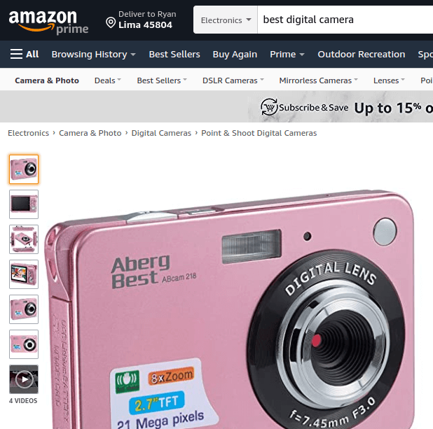
Amazon is a great example of this. There are countless individual pages on the site, and most of them are uninteresting to any given customer. Attribute-based breadcrumb trails at the top of the product listing page show the customer that she is looking at the right categories of products -in this case, digital cameras for beginners.
This also allows customers to quickly notice if they are in the wrong category and go back one or two steps without losing all the filters they have applied thus far.
For example, the customer might want a digital camera, but not a point-and-shoot - she only has to click one step earlier on the breadcrumb trail to get to the right category.
These are visually very similar to location-based breadcrumbs; the big difference is that users can usually customize attribute-based breadcrumbs, much like a search filter system.
Path-Based
Also called “history-based,” this breadcrumb design shows users the path they took to arrive at your site.
These are generated depending upon the individual user’s navigation.
These are the least common types of breadcrumbs website designers use because they tend to be confusing and are made largely irrelevant by the “back” button.
According to some, the popular “back to results” button that allows shoppers to return to a customized list of search results without losing their filters is technically a path-based breadcrumb.
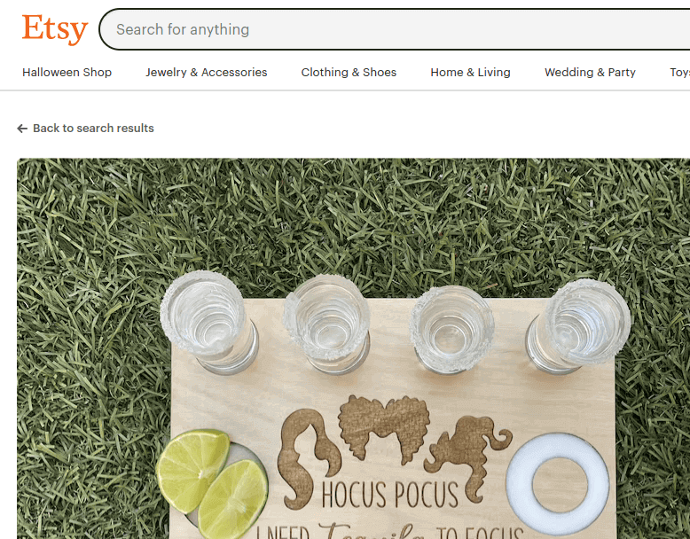
You can see an example here from Etsy.com. This site offers dozens of search filters and a “back” button usually voids them, so a “back to search results” button improves user experience in this case.
How to Create Breadcrumbs
Luckily, creating breadcrumbs is relatively simple. The method does vary depending upon what type of site you are building, so we will break down three of the major platforms for you.
In WordPress
WordPress has many plugins available that will help you create breadcrumbs without having to write the code yourself.
Since so many sites now use breadcrumbs WordPress has seen a proliferation of these plugins. Some good ones include:
- All in One SEO (free version has breadcrumbs enabled)
- Breadcrumb Trail
- Yoast
- WooCommerce Breadcrumbs
- NavXT
Of course, plugins don’t do everything for you. You may need to customize the breadcrumb HTML to achieve the appearance you are looking for.
This is usually accessed through the “SEO” tab on your plugin.
Here, you can change options like your margins or your special character separator using basic HTML.
In Wix
Wix has been slower to offer breadcrumb navigation on its sites.
Currently, you can automatically add a website breadcrumb menu in Wix Stores, but not on other types of sites.
If you want to add a breadcrumb trail in Wix, you’ll need to add it to the site’s code manually.
The Wix Forum offers several code templates that you can use to manually add a breadcrumb trail to your site. On the bright side, HTML breadcrumbs are more customizable than automatically generated ones.
There are options for all three types (path, location, and attribute), so simply copy and paste the one you want into your site’s code while making your own stylistic changes.
In Shopify
Adding a breadcrumb trail in Shopify is straightforward. When customizing your theme, simply click “cart” and choose “show breadcrumb navigation.”
There are fewer customization options with this method, but since Shopify operates almost exclusively for ECommerce sites, a template works pretty well.
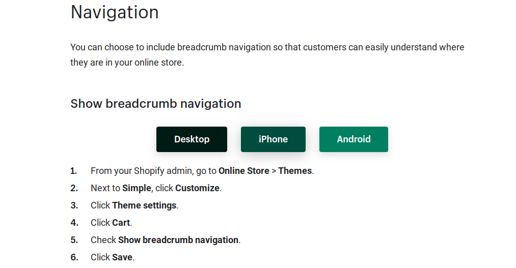
The Shopify Help page has simple instructions, pictured above.
Conclusion: Breadcrumbs Improve User Experience and SEO
If you’re still questioning whether or not to implement a breadcrumb trail on your site, you might want to ask yourself one question: what are breadcrumbs for?
Ultimately, they help your visitors navigate around your site more easily. If a breadcrumbs menu would not add anything to your user experience, then there’s no reason to overcomplicate your web design.
But if you have many pages that branch out more than 3-pages deep into your site (like most eCommerce sites), a breadcrumb trail can both improve your UX and help your SEO score with Google.
